
An app landing page is a single web page built to turn a visitor into an install. It needs a clear promise, working App Store and Google Play badges, a smart banner on iOS, deep links that carry context through the install, and real social proof. In 2027 it also has to load fast on a phone.
Google counts a page as fast when its largest element renders in 2.5 seconds or less (Google web.dev Core Web Vitals guidance, 2024). Many app pages that receive paid traffic miss that line, because they carry a looping hero video, three tracking scripts and a chat widget. You pay for the click, then lose the visitor before the first screenshot appears. This guide covers what the page must contain, how to build it, which benchmarks to hold it to, eight pages worth studying, and the mistakes that quietly drain installs.
Key takeaways
- Core Web Vitals "good" thresholds are 2.5 seconds for Largest Contentful Paint, 200 milliseconds for Interaction to Next Paint and 0.1 for layout shift (Google web.dev, 2024).
- In ApsteQ's LunarLinc campaign, 113 video ads drove 41,420 installs against 468 from 83 image ads (ApsteQ case study, 2023). Your landing page should echo the creative that wins.
- 60% of EarningsCall downloads in the 2022 to 2023 campaign were monthly active (ApsteQ case study, 2023). Judge the page by activated users, not clicks.
- Apple's smart app banner is added with one meta tag and shows in Safari on iOS (Apple Developer documentation).
What does an app landing page need to turn visitors into installs?
An app landing page needs four working parts: store badges, a smart banner, deep links and social proof. Everything else (animation, long copy, founder story) is optional. Miss one of the four and installs leak at a specific, predictable point.
| Element | Job on the page | Where the rules live |
|---|---|---|
| Store badges | Send iPhone visitors to the App Store and Android visitors to Google Play | Apple marketing guidelines; Google Play badge guidelines |
| Smart app banner | Prompts iOS Safari visitors to install, or to open the app if it is already there | Apple smart app banner docs |
| Deep links | Open the right screen in the app, not just the home screen | Apple Universal Links; Android App Links |
| Social proof | Show ratings, press mentions and real usage near the main button | Your own store ratings and verifiable results |
A smart app banner is a strip at the top of a web page, controlled by a single apple-itunes-app meta tag, that Safari renders on iOS. Android has no identical meta tag, so most teams build their own banner or detect the device and swap the badge.
A deferred deep link is a link that survives the install. The visitor taps an ad for a specific offer, goes to the store, installs, and the first launch still opens that offer. On Android, the Play Install Referrer API is one way the store hands that context to the app. Without this piece, every new user lands on the same generic onboarding.
Social proof deserves one sentence of discipline: use true numbers you can defend. ApsteQ's case studies show why quality proof matters. EarningsCall, a US fintech app for investors, had 3K+ monthly active users on 5K+ downloads in its 2022 to 2023 campaign. Enjoy Movies Your Way, a US family streaming filters app, had 38K+ monthly active users on 50K+ downloads by December 2023, which is 76% of downloads active monthly (ApsteQ case study, 2023). A page that can say "used every month by real families" beats one that only says "download now".
The LunarLinc friendship app (Android, India first) went from zero to 50K+ Google Play downloads since November 2023. Its video ads pulled 41,420 installs against 468 from image ads (ApsteQ case study, 2023). That is a creative result, but the lesson carries over: if video won the click, the landing page should open with motion that matches the ad, not a static stock hero.
How do you build an app landing page, step by step?
Build one page per traffic source, with one goal: a tap on the right store badge. Start from the ad or link the visitor came from, then work forward to the install. Eight steps cover it.
- Pick the audience and the promise. One page, one reader. A page for students and a page for parents should be two pages.
- Write the hero. A headline that states the outcome, one line of proof, one button. Keep the hero copy under what fits on a phone screen without scrolling.
- Detect the device. Show the App Store badge to iOS, the Google Play badge to Android, and both plus a QR code on desktop. Desktop visitors cannot install from the laptop.
- Add the smart banner. One meta tag with your app ID covers iOS Safari visitors who scroll past your hero.
- Set up deep links. Use Universal Links on iOS and App Links on Android, plus a deferred link through your attribution provider so context survives install.
- Show the product. Three to five real screenshots or a short muted video. Lead with the screen that proves the promise.
- Tag everything. UTM parameters on inbound links, an event on every store-badge tap, and a campaign name that matches your ad account.
- Test on a mid-range phone over mobile data. Not on your office Wi-Fi.
Match the message to the store page too. Apple lets you build custom product pages for different audiences, and Google Play offers custom store listings. If the landing page promises "split your bills with friends" and the store page opens with a generic feature list, the visitor feels the mismatch and drops. Our guide to app store optimization covers how to align the two, and the wider app marketing plan decides which sources get their own page.
Benchmarks and specs to hold your app landing page to
The cleanest benchmarks for a landing page are Google's published Core Web Vitals thresholds, because they are public, measured at the 75th percentile of real visits, and tied to how Google judges page experience. Treat them as a floor.
| Metric | Good | Needs improvement | Poor |
|---|---|---|---|
| Largest Contentful Paint (LCP) | 2.5 s or less | 2.5 to 4 s | Over 4 s |
| Interaction to Next Paint (INP) | 200 ms or less | 200 to 500 ms | Over 500 ms |
| Cumulative Layout Shift (CLS) | 0.1 or less | 0.1 to 0.25 | Over 0.25 |
Source for all three rows: Google web.dev, 2024. Layout shift matters more than people expect on app pages. A store badge that jumps down as a late image loads is a missed tap.
Here is how to read the numbers for an app page specifically:
- LCP of 2.5 seconds is usually decided by your hero image or video poster. Compress it, size it for the phone, and do not autoplay a heavy video above the fold.
- INP of 200 milliseconds punishes heavy scripts. A tag manager loaded with ten pixels can break it, so load only the tracking you read.
- CLS of 0.1 means reserving space for badges, banners and cookie notices before they load.
- Quality benchmark: 60% of EarningsCall downloads and 76% of Enjoy Movies Your Way downloads were active monthly (ApsteQ case study, 2023; ApsteQ case study, 2023). If your installs come in at a fraction of that, look at the promise on the page before you blame the product.
- Creative benchmark: video ads outperformed image ads by 41,420 installs to 468 for LunarLinc (ApsteQ case study, 2023), though the ad counts differed (113 against 83). Test motion on the page before you assume stills are fine.
One caution: these figures are different campaigns in different markets, so do not average them into a target. Set your own baseline from the first 1,000 visits, then improve one variable at a time.
Which eight app landing pages are worth studying?
Study pages from apps in your category and a few outside it. The eight below are well-known US brands. They redesign often, so open the live page and treat the notes as things to look for, not as a description of today's layout.
- Duolingo: a mascot carries the whole brand voice. Look at how little copy sits next to the main button.
- Spotify's download page: it sorts visitors by device, so a person on a phone sees the mobile path and a person on a computer sees the desktop one.
- Headspace: calm visuals and short sentences that match the product's tone. The page feels like the app.
- Calm: similar category, different approach to imagery. Compare the two side by side to see how restraint changes the page.
- Strava: the community is the pitch, not just the tracker. Look at how the page shows people, not features.
- Cash App: a phone mockup next to a download prompt keeps the product on screen while the visitor decides.
- Robinhood: a regulated finance app, so notice how required disclosures sit in the page without crowding the call to action.
- Notion: one product across web, desktop and mobile, so the page has to route different visitors to different installs.
Take notes on four things for each: what the hero promises, what the button says, what proof sits within one scroll, and how the page treats a visitor on a phone versus a laptop. Borrow the logic, never the layout.
What mistakes make app landing pages lose installs?
Most losses come from five avoidable mistakes: a mismatched promise, a broken device split, lost deep-link context, a slow hero and missing tracking. Each one is cheap to fix and expensive to ignore, especially once paid traffic runs through the page. The two examples below are hypothetical and use round numbers.
- The promise does not match the ad. For illustration: 10,000 visitors arrive from an ad about "bill splitting" and the page opens on a generic "all-in-one money app" headline. If 2,000 tap through to the store and 30% install, that is 600 installs. A page that repeats the ad's promise and lifts store taps to 3,000 gives 900 installs from the same spend.
- The deep link drops the offer. Imagine 1,000 people tap an ad for a first-month discount. Without a deferred deep link, all 1,000 open the app on the generic home screen and have to hunt for the offer. The discount existed on the ad and in the app, but never connected.
- One badge for everyone. Showing only an App Store badge to Android visitors, or the reverse, is a dead end. Detect the device and swap it.
- Altering the badges. Apple and Google both publish rules for their badges. Stretched, recolored or re-lettered badges can get a page rejected from partner placements.
- Heavy hero, no tracking. A 6 MB autoplay video fails the 2.5-second LCP line on a mid-range phone. And if the page fires no event on badge taps, you cannot tell page problems from store-page problems.
The last point matters for ad spend. Sending paid user acquisition traffic to a page you cannot measure is guessing with a budget attached. Fix the measurement before you raise spend.
How ApsteQ approaches this
ApsteQ treats the landing page as one link in the install chain, from ad to page to store to first session, and plans it with the channel and the store listing together. The team has worked on 300+ apps and brands since 2015, led by founder Arsh Singh, who has 20+ years in growth marketing. Across that work ApsteQ has driven 52M+ installs and managed $2.5M+ in ad spend, with 40+ specialists across development, creative, ASO, paid acquisition and AI automation.
In practice that means three habits. First, one page per source, so the promise matches the ad. Second, deep links and tracking set up before launch, not after the first bad report. Third, a read on activated users rather than raw installs, which is how the EarningsCall and Enjoy Movies results above were judged. If you also need the app itself, our app development team builds the deep-link routes in from the start.
Where are app landing pages heading in 2027?
Expect landing pages to get lighter, more specific and easier for AI engines to read. Three shifts matter for 2027 planning.
Responsiveness is now a ranking input. Interaction to Next Paint replaced First Input Delay as a Core Web Vital in March 2024 (Google web.dev, 2024). Pages with heavy scripts now get graded on how fast they react to taps, which is exactly what store-badge buttons depend on.
Store pages and web pages are blending. Apple's custom product pages and Google Play's custom store listings let you vary the store page by audience. The landing page and the store page should share one script, one set of screenshots and one proof point per segment.
AI answers favor structured pages. Engines such as Google AI Overviews, ChatGPT and Perplexity pull cleanly from pages with definitions, tables and plain facts. An app page with a short "what it does, who it is for, what it costs" block is easier to quote than one made only of animation. This is a mechanism, not a measured result, so test it on your own queries.
Privacy limits also keep tightening attribution. Plan on first-party events on your own page, because they survive when third-party signals thin out.
Frequently Asked Questions
What is an app landing page?
An app landing page is a web page with one job: get a visitor to install your app. It normally shows two store badges (App Store and Google Play), a headline that states the outcome, a few real screenshots, and proof such as ratings or usage. Unlike a full website, it removes extra navigation so the install button is the main choice.
Do I still need a landing page if my store listing is optimized?
Yes, because a store listing cannot host your ad's exact promise, a QR code for desktop visitors, or your own tracking events. A landing page gives you one URL per campaign and a clean read on where drop-off happens. Pair it with strong ASO work so the page and the store listing tell the same story.
How fast should an app landing page load?
Aim for Largest Contentful Paint of 2.5 seconds or less, Interaction to Next Paint of 200 milliseconds or less, and layout shift of 0.1 or less. Those are Google's "good" thresholds, measured at the 75th percentile of real visits (Google web.dev, 2024). Test on a mid-range phone over mobile data, not on office Wi-Fi.
Should an app landing page show a QR code?
Yes, on desktop. A laptop visitor cannot install an app, and Apple's smart app banner only appears in Safari on iOS (Apple Developer documentation). A QR code lets that visitor move to their phone in one scan. On phones, hide the code and show the badge that matches the device.
How do I know if my app landing page is working?
Track three rates in order: visits to store-badge taps, taps to installs, and installs to active users. The last one matters most. In the 2022 to 2023 EarningsCall campaign, 60% of downloads were monthly active (ApsteQ case study, 2023). If installs rise but activation falls, the page is promising something the app does not deliver.
Conclusion
A landing page that earns installs is short, fast and specific. It mirrors the ad, routes each device to the right store, carries the offer through deep links, and proves its claim with real numbers. The rest is testing.
- Include all four parts: store badges, smart banner, deep links, social proof.
- Hold the page to 2.5 seconds LCP, 200 ms INP and 0.1 CLS.
- Build one page per traffic source and tag every badge tap.
- Judge success by active users, not just installs.
- Study live pages from apps like Duolingo, Spotify and Strava, then borrow the logic.
Want a second opinion on your current page? Get a free app audit, or book a free strategy call and we will map the page, the store listing and the ad creative as one funnel.
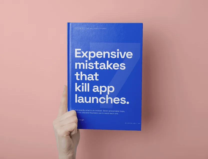
Free download
7 Expensive Mistakes That Kill App Launches
The launch errors we see most often across 300+ app engagements, and what to do instead.
Get the Free EbookBrowse all free guides